Hey there, crypto enthusiasts! If you’ve been scrolling through X lately, you might have stumbled upon a fascinating post by MartyParty that’s got everyone buzzing. This tweet dives into the relationship between Bitcoin’s price and global liquidity, complete with a detailed chart that’s turning heads. Let’s break it down in a way that’s easy to digest, even if you’re new to the crypto game.
What’s the Buzz About?
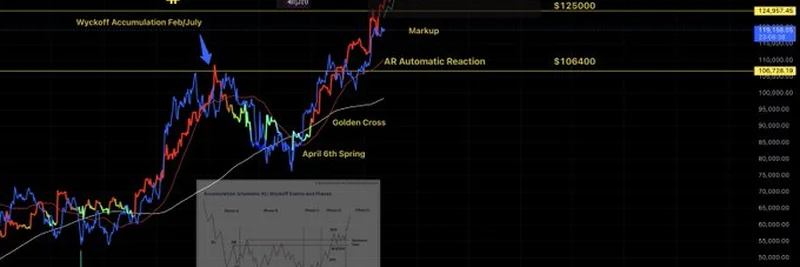
The post features a chart that tracks Bitcoin’s price movements alongside global liquidity, a measure of how much money is sloshing around in the world’s financial systems. MartyParty highlights some key technical indicators, like the Wyckoff Accumulation and Reaccumulation phases, a Golden Cross, and an Automatic Reaction (AR). For those unfamiliar, the Wyckoff Method is a trading strategy that predicts price movements based on supply and demand, while a Golden Cross happens when a short-term moving average crosses above a long-term one—often a bullish signal.
The chart shows Bitcoin climbing from a Wyckoff Accumulation phase in February to July 2025, followed by a Markup phase and an AR. The Global Liquidity line, overlaid on the chart, seems to move in tandem with Bitcoin’s price, suggesting a strong correlation. This aligns with recent analyses, like those from Lyn Alden, which claim Bitcoin follows global liquidity 83% of the time over a 12-month period.
Why Does This Matter?
So, why should you care? Global liquidity—think money supply from major central banks—can influence “risk assets” like Bitcoin. When there’s more money in the system, people tend to invest in stuff like crypto, driving prices up. The chart’s April 6th Spring and Golden Cross markers indicate potential buying opportunities, which could be a green light for investors watching for the next big move.
MartyParty’s post also ties this to a related tweet about U.S. Treasury Secretary Janet Yellen’s comments on a $75 trillion climate change fund. While that’s a different thread, it hints at massive liquidity injections that could fuel Bitcoin’s growth. The community’s reactions range from bullish optimism to cautious bearish takes, showing this is a hot topic worth watching.
What’s Next for Bitcoin in 2025?
Looking ahead, the chart suggests Bitcoin could hit $14,000 or even $12,500 if the current trends hold. With 2025 being a pivotal year—post-halving and amid shifting market sentiments—this could be a golden opportunity for traders. The community’s chatter, like suggestions to use SatLayer restaking, shows people are already strategizing.
Of course, crypto is a wild ride. The chart’s bearish notes from some users remind us to keep an eye on risks. But with global liquidity as a guide, Bitcoin might just keep riding the wave. What do you think—ready to dive in or holding off? Drop your thoughts in the comments, and let’s keep the conversation going!
Stay Informed with Meme Insider
At Meme Insider, we’re all about keeping you updated on the latest in blockchain and meme tokens. Whether it’s Bitcoin’s price action or emerging trends, our knowledge base is here to help you level up. Check out our other articles for more insights, and join our community to stay ahead of the curve!