If you've been following the crypto scene, you know that Bitcoin's price movements often set the tone for the entire market, including those wild meme tokens we all love to watch. Recently, trader and analyst TechDev (@TechDev_52) dropped a fascinating breakdown on X about how business cycle signals explain every twist and turn in Bitcoin's history. Forget the hype around halvings or trending narratives—this is all about the underlying economic rhythms that drive the cycles. Let's unpack what he shared and why it matters for anyone eyeing meme coins right now.
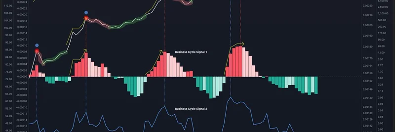
The chart TechDev posted is a goldmine for understanding Bitcoin's behavior. It overlays Bitcoin's price (in yellow) with various indicators: red and green bars representing business cycle phases, a blue line for impulse signals, and a green line for broader market trends. Here's the key takeaway— these signals aren't just random; they've consistently mapped out Bitcoin's bull and bear markets over the years.
First off, TechDev points out that USD tops happen at the peaks of those red bars. Right now? We're not even in red territory yet, suggesting the dollar's strength might still have room to grow before a shift.
Then there's the impulse tops, which align with the blue signal peaks. Interestingly, the last cycle was unique because the red and blue signals diverged—that's why most altcoins, including early meme tokens, hit their highs back in May 2021, ahead of Bitcoin's November peak. For meme token enthusiasts, this is a reminder that alts often lead or lag based on these broader signals, creating opportunities for savvy traders.
Bear markets, according to this model, persist while the red bars are declining. They wrap up when the bars turn green, signaling the end of the downturn. We're past that phase now, which aligns with the recovery we've seen since the 2022 lows.
The real excitement kicks in during the bull market ramp, which happens while those bars stay green. TechDev notes this is the longest green phase ever, meaning we're still in the buildup stage of the bull run. Meme tokens thrive in these environments, as risk appetite grows and capital flows into speculative assets.
But the parabolic phase—the one where prices go absolutely vertical—starts when the bars flip back to red. And guess what? That hasn't begun yet. This suggests the explosive growth many are waiting for in Bitcoin (and by extension, meme coins) is still on the horizon.
Finally, the shape of those red bars dictates the bull market's profile. Think back: 2013's "double-pump" with two sharp spikes, 2017's smooth parabolic curve, and 2021's rounded top. Whatever form the current red bars take will shape how this cycle plays out, potentially influencing everything from meme token pumps to broader crypto adoption.
What makes this analysis stand out is TechDev's emphasis that it's not the Bitcoin halving or fleeting stories driving the market—it's the business cycle. In simple terms, the business cycle refers to the natural ups and downs in economic activity, like expansions and recessions, which influence investor sentiment and liquidity. For blockchain practitioners and meme token hunters, this means paying attention to macro indicators could give you an edge over just chasing the latest hype.
If you're building or trading in the meme space, this insight could help time your moves. With the bull ramp still green and parabolic red not yet in play, there might be more room for steady gains before the real fireworks. Of course, crypto is unpredictable, but tools like this add a layer of structure to the chaos.
For the full context, check out the original post on X. What's your take on these signals? Are we in for a longer cycle than expected? Drop your thoughts below!