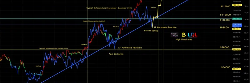
If you're knee-deep in the crypto world, you've probably come across those intricate charts that seem like a mix of art and science. Recently, MartyParty (@martypartymusic on X) dropped a fascinating high timeframe analysis of Bitcoin, dubbing it "The Miran Cycle." This chart isn't just lines and labels—it's a roadmap of where BTC might be heading, drawing on classic technical analysis techniques. Let's break it down step by step, explaining the key concepts so even if you're new to this, it all makes sense.
What the Chart Reveals
The chart tracks Bitcoin's price against global liquidity, showing a steady upward trend since early 2024. It's annotated with phases from the Wyckoff Method, a time-tested approach to understanding market cycles. Wyckoff, named after trader Richard Wyckoff, breaks down how big players (think institutions) accumulate assets before pushing prices higher.
In this visualization, we see several Wyckoff accumulation periods—times when smart money is quietly buying up BTC at lower prices. These are marked from January 2024 onward, with reaccumulations in February-July and September-December 2025. Between these are "markup" phases, where the price starts climbing as demand outpaces supply.
A standout feature is the "AR Automatic Reaction," labeled around November 4th, 2025, as a "Spring." In Wyckoff terms, a Spring is a fake-out drop that tests support levels, shaking out weak hands before a big rally. MartyParty notes that Bitcoin bounced right on this AR (likely standing for Automatic Rally or Reaction), setting the stage for expansion in the markup phase.
The Role of Monetary Policy
The chart kicks off with a note: "Jan 2024 the monetary policy shift started." This ties into broader economic shifts, like the end of quantitative tightening (QT). QT is when central banks reduce their balance sheets, sucking liquidity out of the system—which can pressure asset prices downward. MartyParty highlights that December 1st marks the end of QT, and he predicts the market will "front run" this event, meaning prices could surge in anticipation.
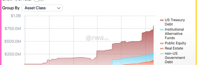
Global liquidity, shown in red, has been rising alongside BTC's price (in multi-colors), suggesting that easier money policies are fueling the bull run. If you're into meme tokens, this macro backdrop is crucial—Bitcoin's movements often dictate the altcoin and meme coin markets, where liquidity floods in during uptrends.
Why This Matters for Crypto Enthusiasts
MartyParty's analysis suggests we're in a markup on expansion, with Bitcoin following his projected line closely. This could mean more upside, especially as we approach the QT endpoint. For blockchain practitioners and meme token hunters, understanding these high timeframe views helps spot opportunities. When BTC pumps, meme coins like DOGE or newer entrants often follow suit, riding the wave of increased risk appetite.
If you've been following similar analyses, this aligns with bullish sentiments in the crypto space. Tools like TradingView let you overlay these Wyckoff schematics on your own charts to test the theory.
Key Takeaways
- Wyckoff Accumulation: Periods of sideways trading where accumulation happens, setting up for big moves.
- Markup Phases: The upward trends following accumulation, where prices expand.
- Spring and AR: Tests of support that precede rallies—Bitcoin just bounced off one.
- QT Endgame: December 1st could be a catalyst for more liquidity, boosting crypto prices.
Stay tuned to voices like MartyParty for these insights, and always remember: this is educational, not financial advice. The crypto market is volatile, so do your own research. If you're building your knowledge base on meme tokens and broader blockchain tech, charts like this provide the macro context to make smarter moves.