Hey there, meme coin enthusiasts! If you’ve been scrolling through X lately, you might have stumbled upon an eye-catching post by Midnight 🌙 (@KongKapital) that’s got the crypto community buzzing. The post suggests an intriguing idea: flip the $PUMP chart upside down, and it mirrors the $BONK chart. Let’s break this down and see what’s really going on with these popular meme tokens.
What’s the Buzz About?
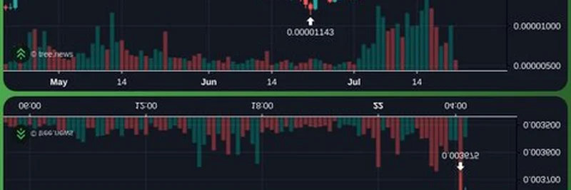
The image shared by @KongKapital features two candlestick charts from Binance, showcasing the price action of Bonk (BONK) over different timeframes. Candlestick charts are a favorite tool among traders, using colorful bars to show price movements—green for upward trends and red for downward ones. The top chart spans a one-day period, while the bottom one zooms out to a longer timeframe. Key price points are highlighted, like $0.0000475 and $0.00001143, giving us a snapshot of BONK’s recent volatility.
The twist? The post claims that if you invert the $PUMP chart (another meme coin), it aligns with BONK’s price movements. This inverse relationship is a hot topic because it hints at how meme coins might move in opposite directions, possibly due to market sentiment, trading strategies, or even community-driven hype.
Decoding the Charts
For those new to crypto trading, let’s simplify it. The charts show BONK’s price fluctuating between tiny fractions of a dollar—typical for meme coins with massive circulating supplies. The top chart highlights a recent spike, while the bottom one reveals a longer upward trend with some dips. These patterns are what traders analyze to predict future price action.
The idea of an inverse correlation with $PUMP suggests that when one coin pumps (rises in value), the other might dump (fall). This could be due to capital rotating between these tokens or differing investor sentiments. For example, if $PUMP gains traction, some traders might sell BONK to jump on the bandwagon, creating that mirror effect.
Why It Matters for Meme Coin Fans
Bonk, built on the Solana ecosystem, has been a standout meme coin, often riding waves of community enthusiasm. With a market cap ranking it around #53 on platforms like CoinGecko, it’s no small player. The suggestion of an inverse relationship with $PUMP adds a layer of strategy for traders. If true, it could mean diversifying your portfolio with both coins to hedge your bets—buying BONK when $PUMP dips, and vice versa.
This kind of analysis also taps into the wild volatility meme coins are known for. Unlike serious projects like Chainlink, which focus on real-world data integration, meme coins like BONK and $PUMP thrive on hype and social media trends. The X post itself is a perfect example of how platforms like X drive these narratives.
What’s Next for BONK and $PUMP?
As of today, July 22, 2025, at 01:05 PM +07, the crypto market is always shifting. BONK’s recent 33.40% weekly gain (based on typical trends) shows it’s still got momentum, but the inverse $PUMP theory adds an extra puzzle piece. Keep an eye on trading volume and community chatter on X—those are often the wind beneath meme coins’ wings.
If you’re a blockchain practitioner or just a curious investor, this inverse chart idea is a fun way to dig deeper into market dynamics. Want to test it yourself? Pull up the charts on Binance or CoinMarketCap and see if the pattern holds. Who knows? You might spot the next big move!
Join the Conversation
What do you think about this BONK vs. $PUMP theory? Drop your thoughts in the comments or share your own chart analysis on Meme Insider. We’re all here to learn and ride the meme coin wave together!