In the ever-evolving world of cryptocurrency, sustainability isn't just a buzzword—it's a critical factor that can make or break a token's long-term viability. Recently, a thought-provoking tweet from Alexander, CEO of ****** Labs and the mind behind AerodromeFi and VelodromeFi, shed light on a glaring issue in the crypto space: the mismatch between emissions and revenue in top tokens.
Alexander points out that a whopping 90% of the top 50 tokens resemble the bottom performers in a key metric—the net emissions to revenue ratio over the past 30 days. This ratio essentially measures how much new token supply (emissions) is being introduced relative to the revenue generated by the protocol. A negative ratio means emissions outpace revenue, potentially diluting value for holders, while a positive one indicates a healthier balance where revenue supports or exceeds new supply.
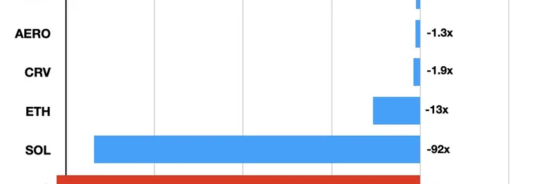
To illustrate, he shared this eye-opening chart:
Breaking it down, tokens like UNI (Uniswap) and BTC (Bitcoin) show infinite negative ratios (-∞), meaning their emissions are overwhelmingly outstripping any revenue—think of it as printing money without backing. SOL (Solana) isn't far behind at -92x, followed by ETH (Ethereum) at -13x. On the flip side, VELO (Velodrome) stands out with a positive +1.7x, and others like AAVE (-1.2x), AERO (Aerodrome) (-1.3x), and CRV (Curve) (-1.9x) have much milder negatives, suggesting more sustainable models.
But here's the kicker: despite these stark numbers, most of the online chatter and "concern trolling" about sustainability targets the tokens with healthier ratios, like the top five in the chart. Alexander argues this selective outrage is at the root of many problems in crypto, from misguided investments to perpetuating unsustainable projects.
This discussion is particularly relevant for meme token enthusiasts. Meme coins, often launched with hype and minimal utility, frequently suffer from hyper-inflationary emissions designed to reward early adopters or liquidity providers. Without real revenue streams—like fees from decentralized exchanges or staking—they can quickly spiral into the -∞ category. Take a cue from protocols like Velodrome and Aerodrome, which integrate revenue-sharing mechanisms to counterbalance emissions. For instance, Aerodrome on Base chain and Velodrome on Optimism focus on liquidity marketplaces that generate actual fees, feeding back into token value.
If you're building or investing in meme tokens, consider this metric as a red flag checker. High emissions without revenue? That's a recipe for dilution and dumps. Instead, look for projects tying emissions to genuine on-chain activity, much like how AERO and VELO are designed.
Alexander's quoted earlier tweet reinforces the need for normalized graphics to compare tokens fairly, treating insider unlocks as emissions and netting them against revenue. Tools like Artemis's net flow charts could evolve into this, helping investors cut through the noise.
In a space riddled with hype, metrics like net emissions to revenue ratio offer a grounded perspective. Whether you're a blockchain practitioner eyeing the next big meme or a seasoned trader, keeping an eye on sustainability could save you from the pitfalls of infinite dilution. What's your take—do these ratios influence your picks? Share in the comments below!