
DefiLlama, a leading platform for decentralized finance (DeFi) analytics, has recently announced a significant upgrade to its Pro dashboards. This enhancement introduces several new features that promise to revolutionize how users interact with and analyze DeFi data. Let's dive into what these upgrades entail and why they matter.
New Features Unveiled
The core of this upgrade lies in the added flexibility for customizing data visualization. Users can now:
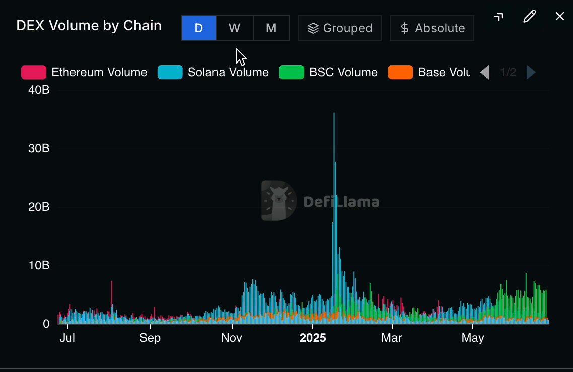
- Toggle between grouped bar and stacked bar charts: This feature allows for a more nuanced understanding of data trends, whether you prefer to see individual contributions or cumulative totals.
- Switch between absolute dollar values and market percentages: Depending on your analytical needs, you can view data in raw figures or as a percentage of the market, providing a dual perspective on the same dataset.
- Group values by day, week, or month: This granularity helps in tracking short-term fluctuations or long-term trends, catering to both day-to-day traders and strategic investors.
These features are particularly timely given the dynamic nature of the DeFi market, where understanding volume shifts across different blockchain chains like Ethereum, Solana, BSC, and Base is crucial.
Why It Matters
For those new to DeFi, decentralized finance refers to financial services that operate on blockchain technology without traditional intermediaries like banks. Platforms like DefiLlama provide essential tools for tracking and analyzing these services, which are often complex and volatile. The ability to customize how data is presented is not just a convenience; it's a game-changer for making informed decisions.
The video accompanying the tweet shows a series of charts that illustrate the DEX (Decentralized Exchange) volume by chain over time. With the new toggles, users can switch views to better understand whether Ethereum's volume spike is an outlier or part of a broader trend, for instance.
Broader Implications for DeFi
This upgrade aligns with the broader trend in the DeFi space towards more transparent and user-friendly analytics tools. DefiLlama's commitment to providing accurate data without ads or sponsored content is a testament to its reliability. In a sector often criticized for its complexity and lack of clarity, such tools are invaluable.
For seasoned DeFi enthusiasts, these enhancements mean deeper insights into market dynamics. For newcomers, it lowers the barrier to entry by simplifying data interpretation. Whether you're tracking the rise of Solana's volume or the steady growth of BSC, these tools make it easier to navigate the decentralized finance landscape.
Conclusion
The upgrade to DefiLlama's Pro dashboards is more than just a technical improvement; it's a step towards democratizing access to critical financial data in the DeFi space. By offering customizable views and detailed analytics, DefiLlama is empowering users to make better-informed decisions in an increasingly complex market. As the DeFi ecosystem continues to evolve, tools like these will be essential for both individual investors and institutional players alike.
