If you're deep into meme tokens, you know that the action isn't confined to one blockchain anymore. Memes are popping up on Ethereum, Base, Solana, and beyond, often trading on decentralized exchanges like Uniswap. Keeping tabs on where the volume and fees are flowing can give you a real edge. That's why the latest update from DefiLlama is a game-changer, and it's got the DeFi community buzzing.
Patrick Scott, better known as Dynamo DeFi on X and a key player at DefiLlama, highlighted this in a recent post. He quoted DefiLlama's announcement about their Chart Builder now allowing users to group data by chain. This means you can track a protocol's usage across different blockchains, switching between absolute values and market share views to spot growth trends easily.
For context, DefiLlama is an open-source platform that aggregates DeFi data, providing transparent analytics on total value locked (TVL), fees, revenue, and more across hundreds of protocols and chains. The Chart Builder is a tool within it that lets you visualize this data customly.
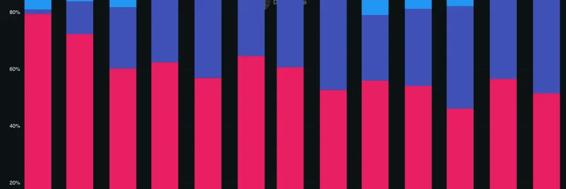
The example they shared? Uniswap fees broken down by chain. Uniswap, as you probably know, is the go-to DEX for swapping tokens, including countless meme coins. With this feature, you can see how fees are distributed—say, how much is coming from Ethereum versus newer layers like Base or Arbitrum.
Here's the market share view:
And the absolute fees view:
Patrick noted that since launching this feature early in the summer, it's evolved from a nice-to-have to an essential tool in his DeFi analysis toolkit. "That's what happens when you iterate rapidly based on user feedback," he said. And he's right—DefiLlama's team has been on fire, incorporating suggestions to make the platform even more user-friendly.
Why This Matters for Meme Token Traders
Meme tokens thrive on hype, liquidity, and low fees, which often means they migrate to the hottest chains. For instance, if a new meme is blowing up on Base because of cheaper transactions, you might see a spike in Uniswap activity there. With DefiLlama's chain grouping, you can:
Spot Emerging Trends: See which chains are capturing more protocol usage. If Solana's share is rising for a DEX popular with memes, that could signal where the next pump is coming from.
Compare Absolute vs. Relative Growth: Absolute views show raw numbers, like total fees in dollars, while market share reveals dominance shifts. This helps assess if a chain's growth is real or just market-wide.
Inform Your Strategy: As a blockchain practitioner, whether you're trading memes or building on them, understanding cross-chain dynamics can help you allocate resources better. Maybe deploy your next meme project on a chain with rising DEX fees.
If you're not already using DefiLlama, head over to their site and dive into the Chart Builder. For the specific Uniswap fees example, check it out here.
This update underscores how tools like DefiLlama are democratizing DeFi data, making it easier for everyone—from casual meme flippers to serious analysts—to stay ahead. What's your take? Have you tried the new feature yet? Drop your thoughts in the comments below.