If you've been keeping an eye on the broader financial markets, you might have caught a fascinating update from MartyParty on X. On September 11, 2025, the crypto commentator and macro analyst shared a chart that's got folks buzzing about potential shifts in the economy—and what that could mean for riskier assets like meme tokens. Let's break it down in simple terms and explore why this matters for the meme coin crowd.
Understanding the Chart: Inverse DXY + USOIL + USINTR
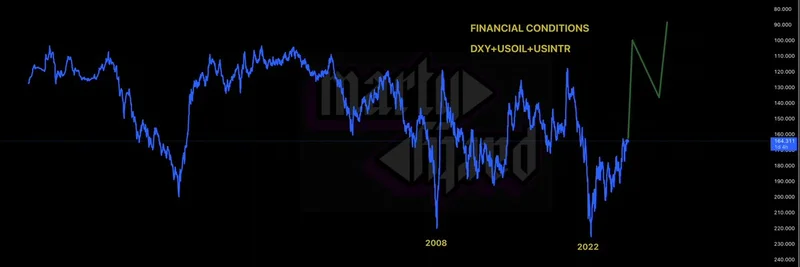
At the heart of the post is a chart labeled "Financial Conditions," which plots the inverse of the sum of three key indicators: DXY (the U.S. Dollar Index, measuring the dollar's strength against a basket of foreign currencies), USOIL (U.S. oil prices), and USINTR (likely referring to U.S. interest rates, such as Treasury yields).
Why the inverse? Think of it this way: When the dollar is strong, oil prices are high, and interest rates are elevated, financial conditions tend to tighten—making it harder for businesses and investors to borrow and spend. By inverting the sum, the chart highlights periods of easing conditions, where lower values in those metrics create a more favorable environment for growth and risk-taking.
The graph spans from the early 1970s to projections into the 2030s, showing notable dips during major crises like the 2008 financial meltdown and the 2022 market turmoil. Recently, there's an uptick, suggesting conditions are loosening up again.
You can check out the original post here for more context.
What This Means for Crypto and Meme Tokens
In the world of blockchain and cryptocurrencies, macro indicators like these play a huge role. Easing financial conditions often translate to a "risk-on" mentality among investors. When money is cheaper and the economy feels more stable, people are more willing to pour funds into speculative assets—think Bitcoin, Ethereum, and especially the wild ride of meme tokens.
Meme coins, built on community hype and viral trends rather than traditional fundamentals, thrive in these environments. We've seen it before: During the post-2020 liquidity surge, tokens like Dogecoin and Shiba Inu skyrocketed as loose monetary policies flooded the markets with cash. If MartyParty's chart is signaling a similar easing phase, we could be in for another wave of meme mania.
Of course, it's not all smooth sailing. The chart also hints at volatility ahead, with potential reversals if inflation picks up or geopolitical tensions spike oil prices. For blockchain practitioners, this is a reminder to stay informed on macro trends—tools like CoinMarketCap or TradingView can help track these indicators in real-time.
Community Reactions and Broader Implications
The tweet sparked a mix of reactions in the replies. Some users, like @lorden_eth, speculated on a possible rejection leading to a dip, while others expressed optimism for stocks and crypto. It's a classic example of how macro analysis intersects with the fast-paced crypto conversation on platforms like X.
For those building or investing in meme tokens, this could be a cue to ramp up community engagement or scout for emerging projects. At Meme Insider, we're all about equipping you with the knowledge to navigate these shifts—whether it's understanding how oil prices affect gas fees on Ethereum or how a weaker dollar boosts global adoption of Solana-based memes.
Keep an eye on these financial conditions; they might just be the spark for the next big meme token surge in 2025. What are your thoughts—bullish or cautious? Drop a comment or hit up the original thread to join the discussion.