In the fast-paced world of cryptocurrency, data visualization can make all the difference in understanding market trends and protocol performance. A recent tweet from Token Terminal perfectly illustrates this point, showcasing six different ways to view Spiko Finance's Total Value Locked (TVL), also referred to as tokenized Assets Under Management (AUM). Spiko Finance, a pioneering protocol in tokenized money market funds, has been making waves by bridging traditional finance with blockchain through real-world assets (RWA) like US and EU Treasury Bills.
For those new to the terms, TVL represents the total amount of assets locked in a DeFi protocol, indicating its popularity and liquidity. Spiko stands out by tokenizing government-backed money market funds, allowing users to earn yields on stable, low-risk investments directly on-chain. This tweet highlights how varying visualizations can uncover unique insights, from overall growth to chain-specific breakdowns—tools that are invaluable for analysts tracking everything from blue-chip DeFi to emerging meme tokens.
Let's break down these visualizations and what they reveal about Spiko's trajectory.
Overall TVL Growth Trend
The first chart is a simple line graph tracking Spiko's TVL over time, showing a steady climb from near zero in October 2024 to around $406.51 million by July 2025. This upward trajectory signals strong adoption, likely driven by Spiko's focus on secure, yield-generating RWAs. For meme token enthusiasts, imagine applying this to track liquidity pools—spotting pumps early could be a game-changer.
Next to it, a bold metric displays the current TVL figure prominently. At $406.51M, it's a snapshot of success, emphasizing Spiko's scale in the tokenized fund space.
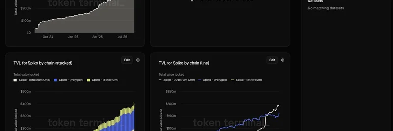
TVL Breakdown by Chain (Stacked)
Diving deeper, a stacked bar chart illustrates TVL distribution across blockchain networks: Ethereum, Polygon, and Arbitrum One. Ethereum holds a significant portion, but Polygon's low fees and Arbitrum's scalability have enabled layered growth. This view helps users see where activity is concentrated, much like analyzing which DEXs dominate trading volume for a hot meme coin.
TVL by Chain (Line Chart)
Complementing the stacked view, individual line charts for each chain reveal nuanced trends. Polygon's line shows consistent gains, while Ethereum's might reflect higher-value deposits. Such granularity is crucial for understanding multi-chain strategies, a tactic meme projects increasingly adopt to expand reach.
TVL by Product and Chain (Stacked)
This stacked chart layers products like USTBL (US T-Bills) and EUTBL (EU T-Bills) across chains. It highlights how US-focused products dominate on certain networks, painting a picture of user preferences. In the meme world, this could translate to breaking down token holders by wallet types or regions.
TVL by Product and Chain (Line)
Finally, line charts for each product-chain combo offer the most detailed look, tracking fluctuations over time. Spikes in USTBL on Polygon, for instance, might correlate with market events or partnerships. Analysts love this for spotting correlations, similar to monitoring social sentiment spikes for meme tokens.
Token Terminal's approach underscores the importance of "last mile delivery" for on-chain data—making complex metrics accessible and insightful. You can explore the full dashboard here to interact with these charts yourself.
For blockchain practitioners and meme token hunters alike, tools like Token Terminal empower better decision-making. Whether you're eyeing Spiko's official site for RWA opportunities or applying these viz techniques to volatile memes, staying data-informed is key in crypto's evolving landscape.
If you're into meme tokens, consider how similar analytics could reveal hidden gems or warn of rugs—head over to our knowledge base for more on DeFi-meme crossovers.