Hey there, meme token enthusiasts! If you’ve been scrolling through X lately, you might have stumbled upon a post by Jimmy Edgar that’s got the crypto world buzzing. Posted on July 4, 2025, Jimmy shared what he calls the "best bubblemaps ever," despite some calling it the worst. So, what’s all the fuss about? Let’s break it down in a way that’s easy to digest, especially if you’re new to the meme token scene or blockchain tech.
What Are Bubblemaps, Anyway?
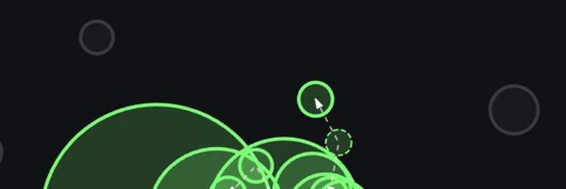
For those unfamiliar, bubblemaps are a cool way to visualize blockchain data. Think of them as a cosmic map where each bubble represents a wallet or transaction, and the connections between them show how money or tokens flow. Jimmy’s post features a vibrant, green-hued bubblemap that looks like a galaxy of interconnected dots and arrows. This particular map, created with the help of bubblemaps.io, is designed to help you analyze on-chain activity, like who’s holding what and how they’re interacting.
The tool has been making waves by integrating with platforms like OpenSea Pro and supporting blockchains such as Solana and Fantom. It’s a game-changer for spotting trends, identifying big players (aka "whales"), and even sniffing out potential scams in the wild world of meme coins.
Why the Controversy?
Jimmy’s tweet sparked a lively debate. Some folks, like @DunlapAmbe62286, chimed in with a playful “It’s the worst 😂,” while others, like @Precog888, shouted, “the best buBBLe maps EVERRR!” The image itself is a bit chaotic—lots of overlapping circles and arrows—which might explain the mixed reactions. But Jimmy’s confident “spoiler alert: its the best” suggests there’s more to this than meets the eye.
The beauty of this bubblemap could lie in its complexity. It might reveal hidden patterns or relationships that simpler maps miss. For meme token investors, this could mean better insights into which projects are legit and which might be a “rug pull” (a scam where developers abandon a project after raising funds).
The Meme Token Connection
At meme-insider.com, we’re all about keeping you in the loop on meme tokens, and this bubblemap ties right into that. Meme coins like Dogecoin have shown how wild the market can get, with prices soaring based on hype rather than utility. Tools like bubblemaps help you see beyond the hype, tracking wallet movements to understand who’s driving the action. Jimmy’s map could be a sneak peek at how these visualizations are evolving to serve the meme coin community.
The thread also got fun with replies like @Flavourtown0x sharing a cute cat-in-bubble-bath pic and @Cbardii1989 dropping a Jack Nicholson meme. It’s clear this is more than just tech talk—it’s a community event!
What’s Next for Bubblemaps?
As of today, July 5, 2025, at 04:51 PM +07, the conversation is still fresh. Some users, like @vrycmfy, are even asking about receiving their “babbles” (likely a playful nod to BBL, the token tied to bubblemaps). This suggests growing interest and possibly future developments. If you’re a blockchain practitioner, keeping an eye on tools like this could give you an edge in navigating the volatile meme token landscape.
So, is this the best bubblemap ever? That’s for the community to decide. But one thing’s for sure: it’s sparking curiosity and conversation. Dive into the thread on X and let us know what you think! And if you’re hungry for more meme token insights, stick with us at meme-insider.com for the latest updates.