Hey there, meme token enthusiasts and blockchain pros! If you’ve been keeping an eye on the financial world, you might have stumbled across a hot topic on X that’s got everyone talking. A recent post by MartyParty (@martypartymusic) on August 3, 2025, dives into the classic Buffett Indicator—a tool used to gauge whether the U.S. stock market is overpriced. But here’s the twist: it suggests the traditional method might be missing a crucial piece of the puzzle—liquidity. Let’s break it down in a way that’s easy to digest, even if you’re new to this stuff!
What’s the Buffett Indicator All About?
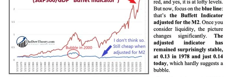
The Buffett Indicator is a simple yet powerful metric. It compares the total value of the U.S. stock market (think S&P 500) to the country’s Gross Domestic Product (GDP). Basically, it’s a ratio that shows how much the stock market is worth compared to the size of the economy. If the number gets too high, it might mean stocks are overvalued—kind of like paying too much for a hot new meme coin that’s all hype and no substance!
Traditionally, this indicator has been a go-to for investors like Warren Buffett himself, who once called it the “best single measure” of market valuations. Right now, the chart shared by MartyParty shows the ratio spiking to around 2.0 (or 200%), which is way above the historical average. That red line on the graph looks pretty alarming, doesn’t it? It suggests the market might be in bubble territory, reminiscent of the dot-com crash in 2000.
The Liquidity Twist
But hold on—there’s more to the story! The post points out that the classic Buffett Indicator doesn’t factor in liquidity, which is essentially the amount of money sloshing around in the economy. This is where M2 comes in. M2 is a measure of the money supply, including cash, checking accounts, and other easily accessible funds. Over the past few decades, M2 has grown significantly, thanks to things like low interest rates and central bank policies.
When you adjust the Buffett Indicator for this liquidity (shown by the blue line on the chart), the picture changes dramatically. Instead of a sky-high valuation, the adjusted indicator has stayed surprisingly stable—hovering around 0.13 in 1978 and just 0.14 today. That’s a far cry from the 0.296 peak during the dot-com bubble in March 2000. In other words, when you account for all that extra money floating around, the market doesn’t look nearly as expensive as the headlines might suggest.
Why This Matters for Investors
So, what does this mean for you? If you’re into meme tokens or blockchain investments, understanding market liquidity can help you spot trends and avoid getting caught in a hype-driven crash. The post argues that the current market, viewed through this liquidity lens, is far from the excesses of the past. That “ever-expanding liquidity” could be fueling a bull market that’s still got room to grow, rather than signaling an imminent bust.
MartyParty’s thread also nods to Manuel Blay (@ManuelBlay3), who’s taken this idea further by factoring in global liquidity. This adjustment suggests we might not even be close to the start of a major bull run, challenging the narrative that Buffett’s shift to cash signals a market top.
Final Thoughts
This X post is a goldmine for anyone trying to wrap their head around stock market valuations. The key takeaway? Don’t just look at the raw numbers—context matters! By adjusting for liquidity, we get a more balanced view of whether the U.S. stock market is truly overvalued. Whether you’re a seasoned investor or just dipping your toes into the world of finance, this insight could help you make smarter decisions.
Want to dig deeper? Check out the full thread on X or explore more market analysis on meme-insider.com. Got questions? Drop them in the comments—we’d love to chat about how this ties into the wild world of meme tokens and blockchain!