Hey there, crypto enthusiasts! If you've ever found Ethereum's inner workings a bit daunting, you're not alone. But thanks to Jordan McK, a creative mind in the blockchain space, we now have some eye-catching visualizations that make it all a lot easier to grasp. On July 29, 2025, Jordan shared a fascinating thread on X, showcasing years of work to visualize Ethereum's complex ecosystem. Let’s dive into this innovative approach and see how it can help both newcomers and seasoned blockchain practitioners!
A New Way to See Ethereum
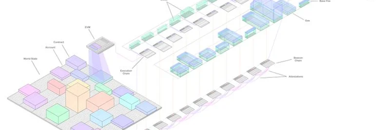
Jordan’s thread kicks off with a stunning 3D diagram that ties together various aspects of Ethereum. The image below is a great starting point:
This visual represents the Ethereum Virtual Machine (EVM), the World State, and the execution layer blockchain all in one go. Think of the EVM as the "brain" that runs smart contracts—those self-executing agreements on the blockchain. The World State is like a giant ledger keeping track of every account and contract, while the blockchain history logs all transactions. Jordan’s model uses colorful blocks and layers to show how these elements interact, making it feel like a digital cityscape!
Breaking Down the EVM
In the thread, Jordan shares a simpler EVM model. The EVM is the engine that powers Ethereum’s smart contracts, and it’s got a few key parts:
- Stack and Memory: Like a computer’s workspace, where data is processed.
- Gas: A fee that keeps the network running smoothly (more on this later).
- Contract Code and Storage: The rules and data for each smart contract.
Jordan imagines the EVM hovering above the World State, tweaking it with every transaction. It’s a cool way to picture how changes happen in real-time!
Understanding the World State
Next up is the World State, visualized as a colorful grid. This is where all the action happens—every Ethereum account (yours included!) and every smart contract has its data stored here. The grey sections are regular accounts, while the colorful ones are contracts. Jordan explains it as a "huge collection of data" that updates with every transaction, kind of like a living database.
Gas Fees Made Visual
One of the trickiest parts of Ethereum is gas fees—the cost of doing anything on the network. Jordan’s thread includes a "gas view" diagram that breaks it down:
- Base Fee: The minimum cost set by the network (shown in green).
- Tip: An extra incentive for validators (in blue).
- Total Volume: The combined ETH paid, represented by the size of the blocks.
This visualization shows how gas costs 131,072 units per data blob, with prices adjusting based on demand. It’s a neat way to see why your transaction fees might spike during busy times!
Why This Matters
These visualizations are more than just pretty pictures. They help demystify Ethereum for everyone, from hobbyists to developers. Jordan’s asking for feedback in the thread—do they make sense? Are they intuitive? Users like Arghya Chowdhury and Alfonso Spencer have chimed in with praise and questions about the tools used (ProCreate on iPad, by the way!).
For Meme Token Fans
Even if you’re here for meme tokens, this insight into Ethereum’s guts can level up your game. Many meme coins run on Ethereum, and understanding gas fees or smart contracts can help you spot opportunities or avoid pitfalls. Plus, Jordan’s work is a goldmine for building your blockchain knowledge base!
Join the Conversation
What do you think of Jordan’s visualizations? Head over to his X thread to share your thoughts or check out his YouTube channel and website for more. At Meme Insider, we’re all about empowering you with the latest blockchain insights—stay tuned for more!