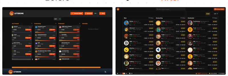
Have you ever felt overwhelmed by the cluttered interfaces of meme token trading platforms? You're not alone. The meme token market, bustling with activity on platforms like BONK and Solport, often suffers from visual noise that can hinder quick decision-making. Enter Vulcan, a UI/UX designer who has taken on the challenge of redesigning these platforms for better speed, hierarchy, and token clarity without losing the distinctive BONK vibe.
The Problem: Visual Clutter in Meme Token Trading
Meme tokens, known for their viral appeal and community-driven nature, thrive on platforms like BONK and Solport. However, the user interfaces (UI) of these platforms have historically been cluttered, making it difficult for users to parse essential information quickly. This issue is particularly critical in the fast-paced world of cryptocurrency trading, where every second counts.
Vulcan identified this problem and set out to fix it. The goal was clear: enhance the user experience (UX) by streamlining the design while maintaining the platform's unique identity. The redesign focuses on two key areas: the home screen (Pro mode) and the token detail screen.
Redesigning the Home Screen: Pro Mode
The home screen, especially in Pro mode, is where users spend most of their time. Vulcan's redesign introduces several improvements:
- Token Cards with Better Scan Hierarchy: The new layout organizes tokens in a way that allows users to scan information more efficiently. Each token card now highlights critical details like the token name, price, and trading volume.
- Live BONK/SOL Price and Real-Time BONK Burned: Users can now see live prices and the amount of BONK burned in real-time, which is crucial for making informed trading decisions.
- Bottom Bar with Essential Toggles: The bottom bar includes toggles for Lite/Pro modes, theme (light/dark), and language options, ensuring accessibility for a diverse user base.
This redesign not only reduces visual clutter but also enhances the platform's usability, making it easier for users to navigate and act quickly.
Token Detail Screen: A Complete Overhaul
The token detail screen is another area that benefited significantly from Vulcan's redesign. Previously, key actions were buried under unnecessary information, leading to confusion and delayed decisions. The new design addresses these issues head-on:
- Live Chart Front and Center: The most critical information, the live price chart, is now prominently displayed, allowing users to track market trends at a glance.
- Always Visible Buy Panel: The buy panel is now consistently visible, reducing the need for users to scroll or search for it.
- Clear Bonding Curve and Metrics: Important metrics and the bonding curve are presented clearly, helping users understand the token's dynamics better.
- Top Holders Without Scrolling: Information about top holders is easily accessible without the need for excessive scrolling, improving the overall user experience.
This redesign ensures that users can make decisions faster and with more confidence, which is essential in the volatile world of meme token trading.
Enhancing Interactivity with Soft Glow Buttons
One of the subtle yet effective changes in Vulcan's redesign is the introduction of primary buttons that respond with a soft glow. This design choice serves multiple purposes:
- Focus on Key Actions: The glow effect draws attention to the most important actions, such as buying or selling tokens.
- Confirm Interactivity: It provides visual feedback that the button is interactive, enhancing the user experience.
- Maintaining BONK's Visual Energy: The soft glow aligns with the platform's vibrant aesthetic, ensuring that the redesign feels native to BONK.
This small detail significantly improves the platform's feel, making it more intuitive and responsive.
Always Visible Bottom Bar
The bottom bar is another critical element of the redesign. It now shows:
- Live BONK Burned: Users can track the amount of BONK burned in real-time, which is a key metric for the platform's ecosystem.
- Live BONK and SOL Prices: Essential price information is always visible, allowing users to react quickly to market changes.
By keeping this information readily available, Vulcan ensures that users don't need to switch tabs or navigate away from their current view, enhancing efficiency.
Catering to a Diverse User Base
Recognizing that not every BONK user has the same needs, Vulcan incorporated several features to accommodate a diverse audience:
- Pro and Lite View Switch: Users can switch between detailed Pro mode and a simpler Lite mode, catering to both experienced traders and newcomers.
- Language Support: The platform now supports English, Korean, and Chinese, reflecting BONK's significant user base in the Asia-Pacific region.
- Light and Dark Mode Toggle: Users can choose their preferred theme, improving accessibility and comfort.
These features ensure that the platform feels native and comfortable for everyone, regardless of their background or experience level.
Staying True to BONK's Identity
Throughout the redesign process, Vulcan remained committed to preserving BONK's unique identity. This is evident in:
- Brand Colors: The use of BONK's distinctive colors ensures instant recognition and maintains brand consistency.
- Subtle BONK Watermark: A subtle watermark in the background reinforces the platform's identity without overwhelming the user.
- Layout Built for Speed and Clarity: The overall layout is designed to facilitate quick decision-making, aligning with the fast-paced nature of meme token trading.
Conclusion: A Design Built for the Future
Vulcan's redesign of BONK and Solport is a testament to the power of thoughtful UI/UX design in the cryptocurrency space. By focusing on speed, hierarchy, and token clarity, the redesign not only improves the user experience but also sets a new standard for meme token trading platforms. As the market continues to evolve, such innovations will be crucial in attracting and retaining users.
For those interested in the technical aspects of this redesign, Vulcan's approach aligns with broader trends in Web3 infrastructure, particularly on the Solana blockchain, where BONK operates. The emphasis on responsive design and real-time data updates mirrors the needs of modern cryptocurrency traders, ensuring that platforms like BONK remain competitive.
If you're a blockchain practitioner or a meme token enthusiast, this redesign offers valuable insights into how user-centered design can transform the trading experience. And for those looking to dive deeper into the world of meme tokens, Meme Insider is your go-to resource for the latest news and analysis.
Stay tuned for more updates on how design innovations are shaping the future of cryptocurrency trading.